Product analytics, at its best, is science.
That may sound like a lofty definition, but consider that “science” is just two simple things—a reliable, repeatable process for answering questions, and another for generating new ones.
An “experiment” doesn’t require a Bunsen burner or beakers. It’s simply gathering information for the purpose of answering questions (scientists like to call this “data for testing hypotheses,” because who doesn’t love fancy words?).
“And what does that have to do with product analytics?” you might ask. The backbone of science—whether it’s the kind you need a lab coat for or the kind your PM team does—is the tried-and-true scientific method. Product managers, engineers, designers, and others do this literally every day.
And if product analytics is science, then being able to autocapture every aspect of your users’ interactions, across all visits—instead of relying solely on manually instrumented or tagged events—is the catalyst you need to answer questions you didn’t know you needed to ask.
For a deeper look at all things autocapture, read the ultimate guide here.
A quick refresher on the scientific method
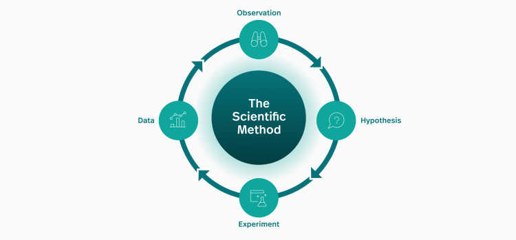
You may recall discussion of the scientific method from grade school, but let’s take a moment to recap. You’ll find many different ways of characterizing it, but at its core, it can be thought of as a loop:
Observation: Something you notice, or a question you want answered.
e.g. “Why isn’t water coming out of my kitchen faucet?”
Hypothesis: A proposed answer or explanation that can be tested.
e.g. “If something is broken with my faucet, then the water in the bathroom sink should still work.”
Experiment: A way to support or falsify your hypothesis.
e.g. Turn on the faucet in the bathroom sink.
Data: Information gathered from your experiment.
e.g. The bathroom sink faucet works, so the problem is isolated to the kitchen faucet. The kitchen faucet must be broken!
It’s a loop rather than a linear procedure, because the data you generate from your experiment produces more observations. Using the kitchen sink example above, the data you generated helped isolate that the kitchen faucet itself is broken, rather than the plumbing to the whole house.
Often they’re observations you didn’t expect, potentially leading down many different paths.
Where science aligns with product analytics
Every time a customer uses your product, they generate reams of data that’s incredibly valuable to you and your team. Nearly every imaginable pattern that can occur, actually does occur for many organizations. In the context of the scientific method, that’s a lot of observations.
We call these “natural experiments,” because you don’t have to create artificial scenarios to gather the data you need. But still, it’s a lot of data to parse—unless you have the right tools on hand.
Enter: product analytics.
The promise of product analytics is that it will help teams sort through all this data to produce the answers and new questions that lead to product improvements.
Let’s cycle back through the scientific method using a real-life example that’s more relevant to product managers, UX, or dev teams.
A simple hypothesis
The scientific method is a useful, proven framework for guiding product development in a structured way, but one that leaves room for serendipity and “unknown unknowns.” You never know where an observation will lead, so your analytics tools need to support rapid exploration, experimentation, and tight feedback loops.
Perhaps the simplest way of explaining the scientific method in the context of product analytics—and how autocapture enables it all—is with an ecommerce example. Let’s start with a simple observation: “How many customers are making it through the checkout process?”
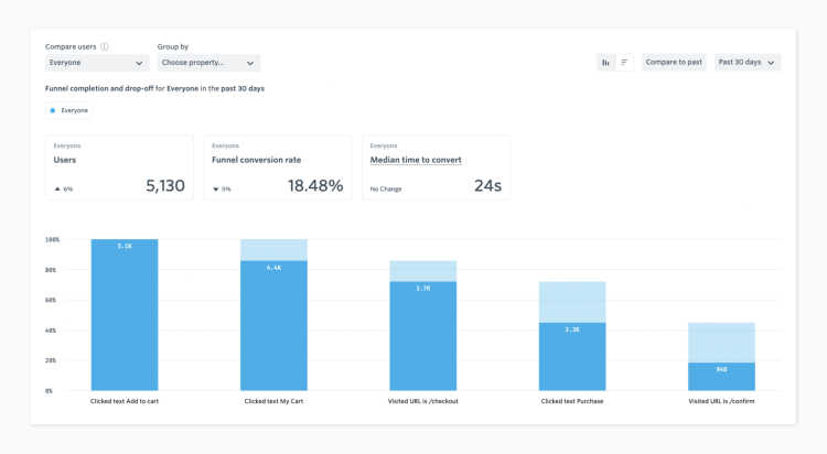
This is clearly in the traditional product analytics wheelhouse, and, presumably, you and your team already have a dashboard that can give you this answer with minimal effort.
You might have noticed that “How many customers are making it through the checkout process?” is just a question, not a hypothesis. (Sometimes, they’re one and the same, but not always.)
Charts like this are data, which you can use to generate hypotheses. If you consider our earlier sketch of the scientific method, such a chart puts us squarely on the “Data” step.
Now, let’s turn that data into an observation. We see here that the total conversion rate is down by 5%. While this is not a huge change for such a small sample, it’s still not something we should ignore.
In order to get to the root of our observation, we need to form a hypothesis we can test.
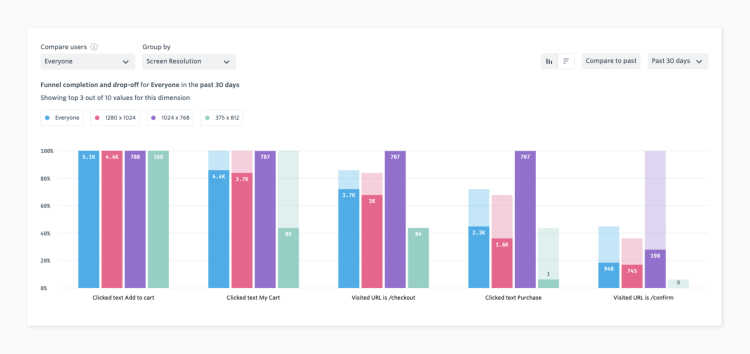
Often, small dips in conversion rate are caused by large drops for a subset of customers. For example, this blip could mean that 100% of your users on a particular device are experiencing a serious issue. In this case, we might start with a few simple hypotheses—perhaps it correlates with the visitor’s country? Or could it be an operating system issue? Or something to do with screen resolution?
Each of these hypotheses can be tested with the data we already have on hand, generated by the natural experiments that occur when users visit our site.
We’d have to experiment to find out.
There we have it—the data clearly shows that no user with an iPhone screen resolution makes it through the last step.
Our observation is that something’s definitely rotten for some screen sizes. We see here that none of these users make it to the end of the funnel, but why? We need another hypothesis we can test, but this data isn’t sufficient on its own.
Session replay is invaluable for generating new hypotheses. We already have a good starting point to narrow our focus—sessions with this specific screen resolution, who never clicked the “purchase” button. Watching a few of these sessions, it becomes apparent that there’s a pretty good reason no one’s clicking it:
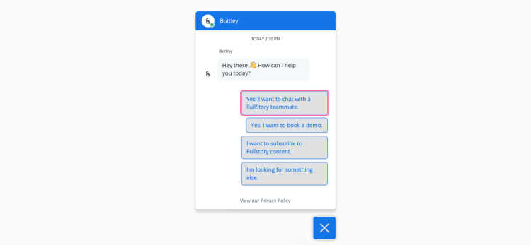
Most of us have fallen victim to this particular failure at one point or another—a chat button that, because of an unforeseen combination of layout and screen resolution, overlaps something crucial, making it difficult or impossible to interact with a key element.
Now we have mutually reinforcing data points—the correlation between screen size and abandonment, coupled with the observation of the chat box blocking the purchase button—that strongly validate our hypothesis.
Clearly this is something that needs to be fixed!
For the sake of brevity, let’s assume that we’ve had engineering fix this layout issue—now what? First, we need to confirm that it’s fixed properly. We can do this even if we don’t have the right phone handy to test on, with a quick search and watching a session on the affected device.
But what we really need is to ensure this issue doesn’t regress. To do so, we create a metric tracking the “purchase” step as a function of screen resolution, which will allow us to track and alert on this case in the future.
More data yields more experiments
Stepping back a bit, we can imagine that this chat bot might be causing other issues—in addition to obscuring a little screen real estate in the corner, it’s also set to automatically display a large message window on our landing pages.
Then, we can hypothesize that this window can be distracting for some users, who feel the need to close it before engaging with the rest of the page. Or worse yet, they simply get annoyed and leave.
(Yes, this is our chat bot. But it isn’t actually open by default!)
How can we test this hypothesis? Let’s start with direct observation, watching some sessions via Fullstory’s Session Replay where users are exposed to the popup, and explicitly close it by clicking the “X.” Watching a few of these sessions supports the notion that some users are annoyed by the popup, and a few even abandon the page soon after closing it.
But we need more than anecdata; we need actual, unbiased data. In this case, we don’t have a good natural experiment to work with, because the same popup is displayed to all users. So we need a field experiment to validate our hypothesis.
In this case, a simple A/B test will generate the data we need, allowing us to compare outcomes for users who either were, or were not exposed to the default popup. In our case, we see a higher abandonment rate for users who were exposed to the default popup, versus those who were not. Now we have solid data to support our proposal that the chat bot should remain closed by default.
Score one for science!
Autocapture brings experimentation full circle
This example demonstrates how a simple question can lead to surprising observations, how those observations lead to hypotheses, and how you can use data to test those hypotheses.
Relying too much on any single tool is like trying to study cells with a telescope, or stars with a microscope. The process of iterative data-gathering and experimentation detailed above simply wouldn’t have been feasible without autocapture and session replay.
Our initial hypothesis would have been impossible to test, without being able to move freely between the high-level view across thousands of users and the low-level view of an individual’s experience.
Following the data wherever it leads requires the ability to answer questions you didn’t know you needed to ask. Capturing all user interactions in advance allows you to close your hypothesis-testing loop quickly. Losing context and waiting on engineering to make simple changes to get more data throws sand into the gears of your product development and analysis processes.
In this age of continuous development, improvement, and delivery—our hypothesis is that no team can afford that extra friction.


