JavaScript user interface development frameworks have embraced modularity to facilitate reuse of UI code across development teams. HTML markup, style information, and behavior are encapsulated in Components that are composed together to produce complex interactive websites and mobile apps. React has risen as the exemplar of modular architecture for modern UIs. With its rise, React has fostered an ecosystem of libraries that facilitate component-based CSS styling.
The issue with CSS in JS
Component styling libraries for React use css-in-js to render CSS information that is scoped to the markup contained within a particular component. One effect of this is that CSS class names are machine-generated and are thus often unreadable by humans. This complicates end-to-end testing since elements under test are often selected via CSS selectors. It may also complicate Fullstory customers’ ability to search for interaction events and set privacy rules since CSS selectors can be used to target page elements; machine-generated CSS class names are difficult to discover and interpret.
Consider this example using React and styled-components from our API reference site:
styled-components output on developer.fullstory.com
There’s some meaningful content in those CSS class names, but there’s also machine-generated cruft. On other sites, there might be no human-readable data at all.
Data attributes to the rescue
HTML5 introduced data attributes so developers could store additional metadata about HTML elements. Fullstory supports data attribute search, which means that data attribute names and data can be used to search for interaction events.
How can we best bridge the gap between React developers using styled-components and our data attribute search capability?
Introducing @fullstory/babel-plugin-annotate-react
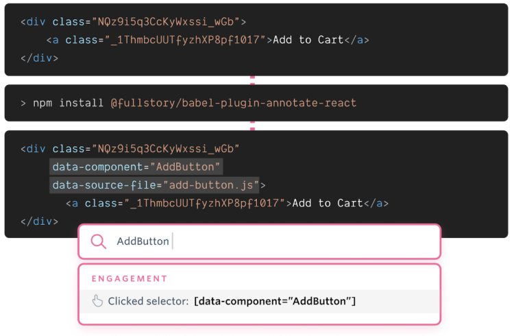
Taking inspiration from and building off of the awesome work David Sancho has done on the babel-plugin-transform-react-qa-classes project, we created a babel plugin that automatically adds data-component, data-element, and data-source-file attributes to React and React Native DOMs: @fullstory/babel-plugin-annotate-react. These values can be used to reliably identify page elements for end-to-end testing and when trying to understand user behavior (and protect user privacy) in Fullstory.
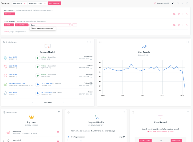
data-* attributes are automatically generated by our Babel plugin and searchable in Fullstory
Installation and Setup
To install this plugin, simply execute:
You can then enable the plugin in your existing babel.config.js file.
For React:
For React Native:
Custom Components
Let’s take an example of a simple custom component:
When using this in a React application, all we need to do is declare it as part of our layout:
However, since Bananas is just an abstraction around a simple img element, it wouldn’t make sense for Bananas to show up in the final html that is rendered by the browser - and it isn’t:
This is great for efficiency, but it comes at a price. How can we use a css selector to find all of the Bananas components on a page? If we have knowledge about the inner workings of the Bananas component, we could simply select any img that has a src attribute of “https://upload.wikimedia.org/wikipedia/commons/d/de/Bananavarieties.jpg”.
This approach might work on simple examples, but it is brittle and requires knowledge of a component that might not always be available.
What if we could automatically retain some of the relevant information of the custom component in a way that keeps the efficiency of the flattened layout?
The first thing we can do is add an attribute on the root element of Banana - in this case an img - that specifies the original component name:
Now we can easily create a selector to find all of the Bananas on a page by selecting any element that has the attribute data-component with the value “Bananas”.
Looking for Bananas
Great! However, Bananas is a common word and we might run across another library that provides some functionality that we want that also exposes a component named Bananas.
Since the babel plugin also adds a data-file-source attribute, we can specify the source file that this Bananas component came from:
We can use this additional information on the selector to indicate which Bananas component we are referring to.
Styled Components
Styled components are distinct from custom components and can potentially lose some type information during the compilation process. Let’s look at a very simple styled component example that declares Title and Anchor:
The final html that is rendered removes most of the styled component information:
The existing styled-components babel plugin adds a class to each style-component information, class="App__Title-sc-17" and class="App__Anchor-sc-17". This is helpful because it preserves both the composed class name and styled component name. However, due to the suffix hash, these selectors are unstable and can make selector targeting in Fullstory a bit tedious and error-prone.
It would be useful to know the names of the original styled components that were used in a stable fashion, and this is where data-element can help:
We also preserve the original component class name as data-component="App", so hierarchical selectors can easily be created to find the target styled component.
React Native
React Native is a very compelling framework choice for companies that want to leverage their React knowledge to create mobile apps for both Android and iOS.
Our new babel plugin can help React Native developers as well. Let’s take a React Native app that gets generated from create-react-native-app:
View and Text are both React Native controls that get rewritten when the app is loaded. The DOM on a device will be shown from the React Native Debugger as follows (simplified a bit):
Notice how the View is actually defined as an RCTView and Text has a subelement generated called TouchableText. In practice, many of the React Native controls are swapped out during rendering and will appear differently on Android and iOS. To simplify this, we will add our attributes as follows:
Note: Under the hood we are actually using camelcase for the attributes, but when using Fullstory for Mobile Apps, the playback will convert the camelcase back to kebab-case automatically.
As you can see, these new attributes are automatically generated and preserve the necessary source information so that we can easily generate a selector to search for all View or Text controls in the DOM.
Conclusion
We hope that fullstory-babel-plugin-annotate-react will help you more easily target elements in your React apps, whether you're a customer of Fullstory or if you’re looking to improve your end-to-end testing game for your websites or mobile apps. All of this makes for a better digital experience for your users, which is what Fullstory is all about.
You Might Also Like
Private by default: The hard way, but the right way to understand mobile experiences
Understand the user impact behind your New Relic traces with Fullstory
Understanding React + Redux errors with Sentry and Fullstory


