What is user friction?
User friction—also called user experience friction or UX friction—is anything that keeps a user from accomplishing a desired action on a website or app. Just like physical friction prevents your shoes from slipping on a slick hardwood floor, digital friction can prevent users from achieving their goals online—for example, making purchases.
User friction can happen for many reasons:
A site or app isn’t intuitive
There’s a bug or malfunction
The user interface isn’t designed clearly or isn’t usable
An action requires too many extra steps to complete
Pages have slow load times
Forms or other inputs don’t follow best practices
Users mistaken take irreversible actions
User expectations are simply not met
It’s clear that design and product teams need to be vigilant when it comes to reducing user friction. Otherwise, these issues will lead directly to increased abandonment, reduced conversion, and lost revenue.
The different types of user friction
Understanding UX trends can help address the different types of user friction that occur on websites or apps.
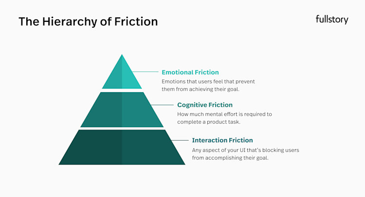
Three key categories of user friction are emotional friction, interactive friction, and cognitive friction. Here’s a quick look at what can cause each of these kinds of user friction.
Emotional friction
Emotional friction is often considered the most complex type of user friction and deals with users’ feelings.
Users often experience emotional friction when it’s difficult to complete a task on a site or app, with can result in negative emotions on the user's side. Generally, UI design tools aim to evoke positive emotions and avoid making users feel bad while using a product.
One example of an app that focuses on evoking positive emotions is the project management software, Asana. When a user marks a task “complete,” Asana rewards users with a satisfying shade of green and whimsical, celebratory characters zoom across the screen—creating positive feelings for the user who just completed a task.
You’ll notice this in the many other apps that gamify a user’s journey through rewards, scores, checklists, etc.
Interaction friction
Interaction friction is more easily quantifiable than emotional friction, as it occurs when a site or app’s interface is confusing or not easily navigable for users. When you can create a user experience with little or no interaction friction, you reduce the likelihood that a user will become confused or frustrated and abandon the site altogether.
Apple is a great example of a company that’s minimized UI and interaction friction, effectively revolutionizing mobile devices.
Since its introduction in 2007, the iPhone has offered a level of usability that’s been largely unmatched by any other smartphone manufacturer. This is likely due to Apple founder Steve Jobs’ unique design philosophy, which roughly states that you should start with the user experience and work backward to the technology, rather than the other way around. This is a powerful example of how user experience—rather than technology—can make your product shine.
Cognitive friction
Cognitive friction is a user experience issue that occurs when an interface doesn’t function in the way a user expects it to, and requires too much cognitive load to complete a given task.
To avoid cognitive friction, UX designers try to make an interface mimic the real world as much as possible, increasing the chances it seems intuitive.
For example, when shopping online you add items to your “cart” or “bag,” which is exactly what you would do while shopping in real life.
Imagine if you visited an ecommerce site that prompted you to “save” or “bookmark” an item—you’d probably be confused or feel uncomfortable, and leave for a site that used familiar terms.
How to identify user friction
In the past, finding friction in user journeys required collecting qualitative data. That is, conducting time-consuming interviews or counting on your users to leave feedback. Each of these is highly unreliable, considering only 12% of consumers are likely to provide feedback to a business when they encounter an issue.
That’s why it’s a team’s responsibility to combine different types of data and find insights through both qualitative and quantitative research.
With modern product analytics and a behavioral data platform, you can automatically detect different types of friction. This means you no longer need to wait for users to tell you that they are frustrated—you can proactively find and fix many different types of friction using features like session replay and heatmaps to visualize user frustration.
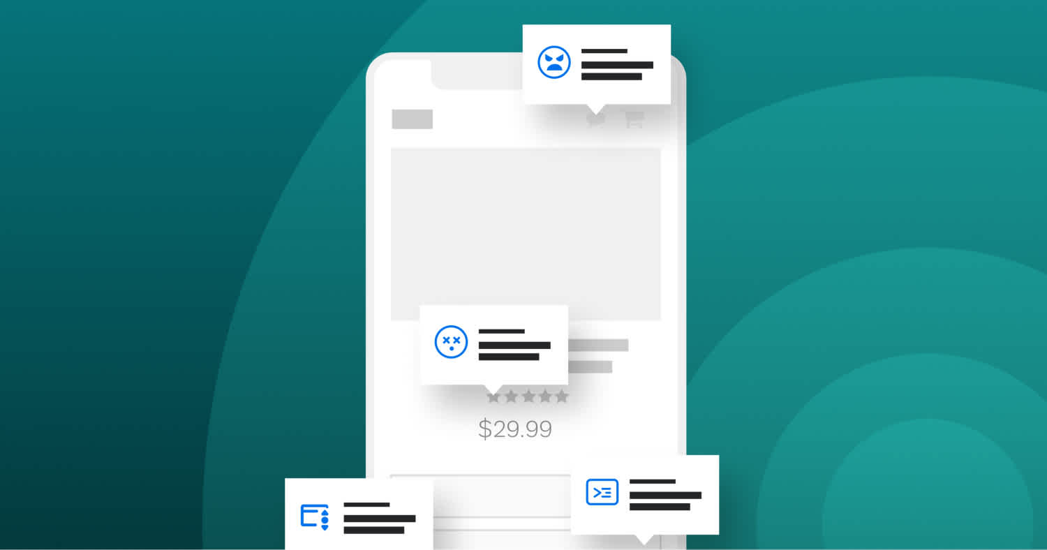
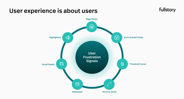
What types of friction should you be looking for? Here are some signs that your users are having frustrated experiences.
Rage Clicks
Rage clicks happen when users click or tap rapidly on your site or app, usually signaling that a button isn’t working (or isn’t working quickly enough).
Users might Rage Click on many different elements on your site or app, from buttons to graphics to text. Typically, Rage Clicks mean that an element on your site isn’t meeting a user’s expectations.
For example, one fintech company found that people were Rage Clicking on credit card logos on their checkout page, believing they were buttons to select their payment type. In reality, the icons were only there to show accepted cards; this unnecessary checkout friction was actively stalling the user journey. By removing the frustrating element, the company saw a 7% increase in conversion rates.
Dead Clicks
Dead Clicks are the result of a user clicking or tapping on a non-clickable element. Dead Clicks and Rage Clicks are similar, considering that users might end up Rage Clicking on an element that doesn’t actually change the page. However, a Dead Click is a single click or tap rather than rapid-fire clicks.
Dead Clicks are more subtle than Rage Clicks, so it can be more difficult to determine what a user is actually trying to do when a Dead Click occurs. For example, a user may be clicking the background of a webpage, which would result in a Dead Click, but it can be difficult to understand if they are trying to escape an overlay, ensure focus is on the page, or something else.
Error Clicks
An Error Click occurs when a user triggers a client-side JavaScript error, though the user might realize that they’ve encountered a broken element.
By watching user sessions that include Error Clicks, developers can more easily diagnose and solve bugs by seeing the conditions that produced JavaScript errors.
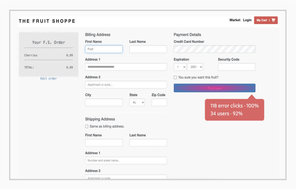
Searching and monitoring the top Error Clicked elements on your site or app can help you understand if a critical button—like an “Add to cart” button—is malfunctioning and potentially costing you revenue.
Thrashed Cursor
Cursor thrashing is when a user moves their cursor rapidly back and forth across a web page, typically indicating some type of frustration.
There are a few instances that might elicit cursor thrashing, the most common being slow load times.
A thrashed cursor could also mean that a user can’t figure out or find something they’re looking for on a page. For example, if a user is trying to locate the search bar on your website, they might move their mouse around quickly while their eyes search the page.
It’s important to keep in mind that Thrashed Cursors could be a false positive; perhaps a users’ mouse is broken or they are trying to locate their cursor on a page. If you’re getting Thrashed Cursor signals on your website, the best first step is to watch a session that contains cursor thrashing and try to see what’s happening.
Form Abandonment
Filling out online forms is almost universally frustrating. Sometimes the “tab” key will take you to the same box and sometimes it won’t, some forms will alert you along the way if you’ve made an error and some wait until you try to submit it, and some forms are just plain long and tedious.
And no matter how many best practices you follow — an easier workflow, instant validation, faster load time, a simple layout, etc. — you’ll notice your users are usually unique to your site.
Whatever the issue, Form Abandonment is an extremely common problem for online companies and customer experiences. That’s why you should search for browser sessions where users abandoned a form and utilize session replay to watch sessions and understand exactly where and why users give up. You can identify the specific field causing friction and then use that info to make it better for users.
Looking for form abandonments is a smart way to find instances of user frustration, and addressing those issues can help product teams improve conversion funnels and see higher conversion rates.
Pinch-to-Zoom
Though a more subtle frustration signal than others covered here, Pinch-to-Zoom is when a user uses a touchpad or touchscreen to zoom in or out. This signal can be detected from any device that has a touch interface or multi-touch trackpad—including desktop and mobile.
Pinch-to-Zoom almost exclusively indicates that some element of your digital experience is sized improperly or is displaying incorrectly. For instance, an ecommerce site might render on mobile in such a way that the “add to cart button” is cut off, and the user needs to zoom out to get to it. Or, the text on a web page might be too small to read comfortably, causing a user to zoom in.
Is user experience friction always a bad thing?
In short: No. Believe it or not, there are times when friction can actually be beneficial to the user experience.
There are certain times when users appreciate a measured amount of friction—like when handling personal information, finances, or other sensitive information online.
Google’s 2-Step Verification is a great example of good friction. Does anyone really enjoy taking the time to go through a two-step login process for their Google account? Probably not. But when so much of our digital lives is powered through the Google suite, users can appreciate the need to take the extra action to keep their information and documents secure. Plus, Google does an excellent job of making two-step authentication as painless as possible by storing passwords and enabling your devices to communicate with one another.
How can design modification reduce friction?
Reducing friction in your user experience has many obvious benefits: decrease user frustration, increase conversions, drive loyalty and retention, and ultimately boost revenue.
Through navigation and usability testing and product analytics solution to monitor user frustration signals—Rage Clicks, Dead Clicks, Error Clicks, Thrashed Cursors, Form Abandonment, and Pinch-to-Zoom—you can pretty quickly identify the elements on your website that users are getting hung up on.
Once you’ve pinpointed an area of friction, watch user sessions to understand what should be happening. You can also use A/B testing—such as trying different layouts or simplifying workflows—to determine which changes reduce friction most effectively. A/B testing helps you make data-driven decisions to enhance user experience and improve overall site performance. Is it that a button should trigger an event and doesn’t, or that a user should be able to find the item they want and can’t?
Fullstory can help you avoid critical user friction mistakes
Figuring out where your users run into friction issues doesn't have to be a guessing game.
With Fullstory, easily quantify where and how often your users are getting frustrated, and use session insights to understand why.
With Fullstory's Digital Experience Intelligence platform, every Rage Click™️, dead click, error click, and thrashed cursor is automatically logged so you know what your users love—and what they don't.
Sign up for a free 14-day trial and get to the bottom of your site or app's biggest UX mistakes.
