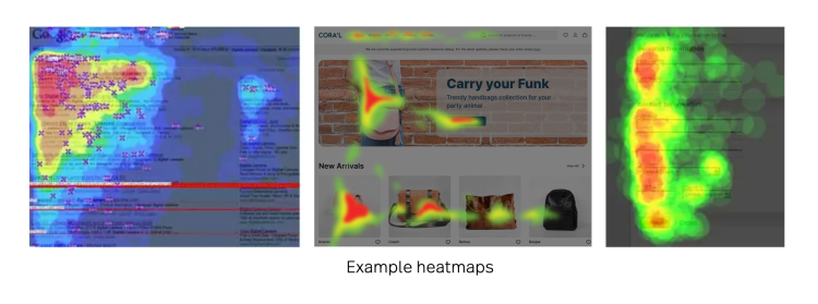
Heatmaps are some of the most important data marketers can analyze to make their websites more effective.
And knowing the kinds of heatmaps at your disposal can help you understand where user behavior patterns are emerging and how you can make changes to meet their needs.
In this article, we cover all things heatmaps—what they are, how they work, and the different types that will benefit you most.
What is a heatmap?
Heatmaps are graphical representations of numerical data. Think of a heatmap as a way of understanding how popular certain elements of your website or mobile app are. It shows where people are scrolling, clicking and where they stick around a warm-to-cold color scheme.
In general, heatmaps allow you to:
Track user behavior
Evaluate user interests on your website
Understand what’s ignored on your website
Test call-to-actions
Find out what causes friction
Catch page abandonment in action
Conversion rate optimization and design
The key benefit of heatmaps is that they simplify complex numerical data sets into easily understood visuals.
Additionally, heatmaps are powerful tools with many use cases, and applications across many industries.
A few heatmap examples:
Streaming services use heatmaps to optimize their viewing experience by identifying target audiences’ interests, understanding which recommendations users look at and which they ignore.
The stock market uses heatmaps to identify trends in the market at a glance. It uses a cold to hot color scheme to analyze stock options.
Sports teams use heatmaps to plot players’ performance, identify patterns for improvement, and study rival strategies.
Website heatmaps
Website heatmaps provide insights into user behavior, making them a valuable tool for businesses. Specifically, a heatmap uses color-coding to visually represent how users browse your website.
A website heatmap is a true representation of all visitor actions—whether that be engagement, frustration, or friction—heatmaps showcase it all
Types of website heatmaps
1. Clickmap
A clickmap is a map of how people use a website or a specific landing page. Clickmaps show you an overall aggregate of where visitors click their mouse and can be referred to as “touch maps”.
Clickmaps can help identify navigational gaps on a webpage or mobile device. Are your users completely missing where to go next? Find out with a clickmap.
Clickmaps also show which parts of a webpage are clicked on the most (and the least) and help identify navigational and conversion problems.
One use case may be gathering data on CTAs. Or if users are clicking on areas that are not clickable—like an image or text that people expect to be linked. That gives you insight into what to change on that particular page.
Pros of clickmaps:
Improve ROI by placing effective CTA buttons and monitoring them with clickmaps.
Clickmaps allow you to identify and remove areas that cause friction and distract users.
Clickmaps visually represent which categories and areas are most popular and where the gaps are.
When running a clickmap on your website, it allows you to monitor conversion rates for new and returning visitors.
Cons of clickmaps:
Improper readings may occur from accidental (multiple) login use, where a user repeatedly clicks on the same element.
Frustrated clicks like rage clicks can skew data analysis.
There may be other issues caused by interactive elements, responsive design rules, browser/device incompatibilities, or differences in page content.
Pro tip: Track at least 2,000 page views per screen for accurate clickmap readings.
Heatmaps 101: What is a heatmap?
Find out what heatmaps are, how they started, how they’re created, and how you can use them to make data-driven decisions
2. Scrollmap
A scrollmap is a type of heatmap that’s a visual representation of visitors' scrolling behavior on your website.
On a scrollmap, the top of the page is red, meaning that it’s the most viewed area on the page, and the color turns yellow to green to blue towards the bottom of the page, showing fewer and fewer visitors scrolling.
Specifically, scrollmaps tell you:
the number of visitors who scrolled through a page to the bottom.
the number of visitors who scrolled through a page but did not scroll to the bottom.
the number of visitors who abandoned a page.
Use scrollmaps to help calculate the ideal length of a webpage beyond which visitors don't scroll down, identify whether or not visitors reach the content below the fold, and spot false floor or false bottom.
Additionally, scrollmaps help identify important content being ignored—like the most actionable items you can use to be successful.
Pros of scrollmaps:
A scrollmap is beneficial when designing longer web pages by helping you understand where to prioritize important elements.
Use scrollmaps to develop strategies to entice users to scroll further down to the page.
Scrollmaps are an excellent tool for optimizing “above the fold”. Above the fold is the part of your website that visitors can see without needing to scroll down and is typically the most visited part of the page.
Cons of scrollmaps:
Scrollmaps don’t always provide accurate data visualization. Scrolling activity is not necessarily an indication of how they are engaging with the content.
Scrollmaps don’t measure clicks, which doesn’t allow you to measure the effectiveness of an element.
A scrollmap may not be beneficial for websites with dynamic elements. With web design becoming more dynamic, it can complicate scrollmap data.
Further viewing: Learn more about how Fullstory's utilizes scrollmaps in our platform
3. Error click heatmap
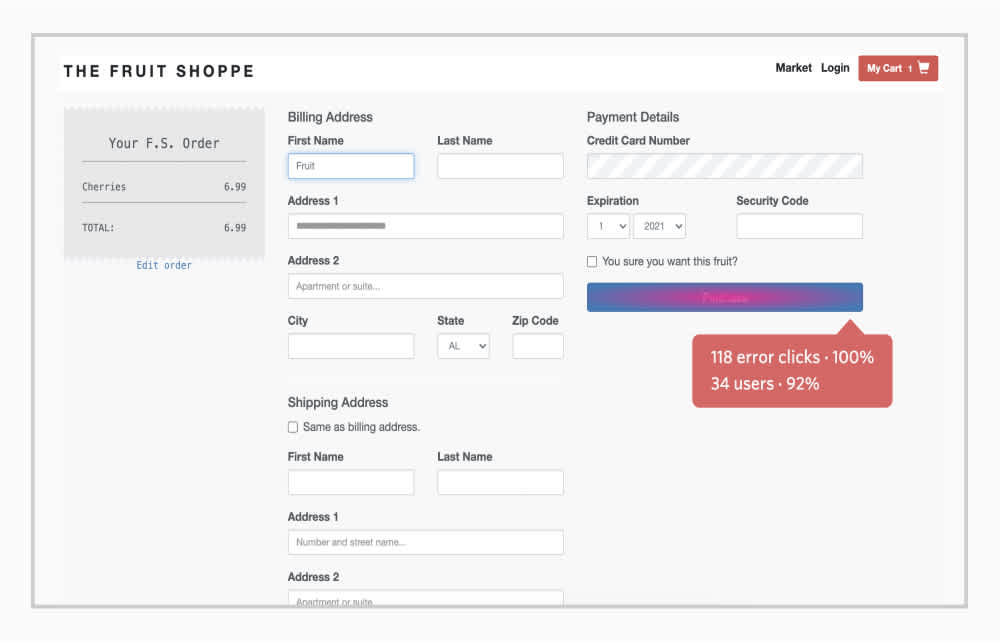
Error clicks are when a user click triggers a client-side JavaScript error or website error occurs. Error clicks may or may not result in a user noticing something is broken.
With a behavioral data platform like Fullstory, you can create an Error Click heatmap to pick up any unforeseen errors on your website.
You can use this heatmap to specifically investigate console errors or uncaught exceptions.
If you find something that seems wrong, you can run another search scoped to the specific click event that triggered the error and view all user sessions with Error Clicks around that event.
Pros of error clicked heatmaps:
With error clicks, you can reproduce bugs on the fly to proactively fix them before a user engages.
Error click heatmaps can drastically improve the online experience on your site or app.
Error clicks can be helpful in surfacing a functional sample of data sessions to research.
Cons of error clicked heatmaps:
Error clicks can be the result of many different factors (web design, hosting issues, etc) and it may take time to find the source.
Error clicks don’t provide the context for the error.
Error clicks are likely to be noticed by users, creating frustrating online experiences.
4. Rage click heatmap
Rage clicks occur when users rapid-fire click (or tap) on your site or app in frustration. Whether the button or area doesn’t function or is producing an error, the rage clicking showcases friction with the product.
A rage click heatmap will show you all the areas that a user has frustratedly clicked errors, with signature heat indexes. It's not easy to predict what might cause a user’s rage, which is why searching your user sessions in a best-in-class DXI solution for Rage Click events is so helpful—you'll discover unexpected opportunities.
Pros of rage click heatmaps:
Rage click heatmaps can help you reproduce unexpected bugs and errors to proactively fix them.
Rage click heatmaps can correct any confusion on CTAs for better conversions
Rage clicks are a strong signal and therefore lead to actionable insights
Overall, these heatmaps can increase your ROI due to clearing up product friction across the board.
Cons of rage click heatmaps:
Rage click heatmaps may (at first) surface false positives. For instance, users may be paging through a multi-page app and click repeatedly on the same element.
There are all kinds of web elements that can induce rage clicks, from graphics to text, so pairing them down can be tricky.
5. Dead click heatmap
Dead clicks are when users click an element on your website or app but the click has no effect. Dead click heatmaps will find any non-functioning element with heat signatures and data intelligence.
Pros of dead click heatmaps:
Understand behavioral trends with dead click heatmaps over time and create new opportunities.
Stop non-functioning CTAs before they hit mass-market product updates.
Cons of dead click heatmaps:
Dead clicks’ behavioral signals can be nuanced and subtle, which makes them hard to find.
There is a chance for false positives with dead click heatmaps—based on the different website functions and user behavior.
Thrashed cursors: an actionable insight to keep a close eye on.
6. Mouse tracking heatmap
Mouse tracking heatmaps help identify areas on which visitors are spending the most (and the least) time on your website. It has many names: mouse movement heat map, move map, attention heatmaps, or hover maps.
Mouse heatmaps visually represent user mouse movement data using thermal imaging – it records where visitors are navigating, clicking, scrolling, and stopping on your website.
Research shows a correlation between where users are looking and where their mouse cursor is, so these can be helpful.
Pros of mouse tracking heatmaps:
Mouse heatmaps allow you to identify hover patterns that can help discover areas of high visitor frustration and friction.
Mouse tracking also helps to optimize complex web pages made up of content, images, and dynamic elements in any matrix.
Mouse tracking has the ability to estimate the relevance of search results by the volume of clicks.
Cons of mouse tracking heatmaps:
Users tend to be “over-clickers” and click on literally everything, which can impact mouse-tracking data.
With mouse heatmaps, you have to rely on the visitors’ own objectives, not a controlled testing environment.
Additionally, you can’t ask your users direct questions about their experiences with mouse tracking—so you ultimately don’t know what their intentions are.
7. Eye-tracking heatmap
Eye-tracking heatmaps provide information about where visitors are looking on a given page.
They can also be used to track the visitor's gaze pattern to place all-important content and images in the most attention-grabbing sections of a page.
Eye-tracking heatmaps can be used to ascertain how engaging certain images on a website are.
Pros of eye-tracking heatmaps:
Eye-tracking heatmaps provide incredibly accurate data. It will show you exactly what users are looking at on your web page.
These types of heatmaps go hand in hand with mouse tracking maps, which can validate user data results.
Eye-tracking is based on natural human reactions, so you can see user flow easily.
Cons of eye-tracking heatmaps:
Eye-tracking data results are typically based on a small sampling of unique visitors.
Eye-tracking heatmap tools are costly and that cost can increase the more users you’re trying to track.
Some advanced users know they are being tracked and have the ability to cover up their cameras.
8. AI-generated heatmaps
Artificially intelligent (AI) generated attention heatmaps are visual representations of user attention data created by a software algorithm. Heatmaps generated by AI show which areas of the website users are likely to view the most (and the least).
Typically, AI heatmaps focus on imitating the first 3-5 seconds of user attention on a website—in order to predict future behavior.
Pros of AI-generated heatmaps:
AI-generated heatmaps can predict where people will look when engaged with a website—which can be beneficial for future improvements.
Since eye-tracking heatmaps are costly, an AI-based alternative is less expensive.
AI-generated heatmaps have up to 95% accuracy.
These heatmaps can validate your concepts prelaunch and also analyze your potential client’s websites to gather valuable insights.
Cons of AI-generated heatmaps:
AI-generated heatmaps don’t work well with low-volume websites, as there are fewer actions to predict.
These heatmaps often come with restrictions on actionable usage and are often pay-to-play.
Heatmaps and DXI
Heatmaps are incredibly resourceful for any website looking for insights on users.
With a DXI solution like Fullstory, you can access your colorful new heatmaps—or Click Maps—with Page Insights from within any session replay. Get a high-level view of how your user is engaging with just about anything.
Use Fullstory’s heatmaps on your homepage, your products page, your purchase forms, or any new features.
Learn more about heatmaps in Fullstory — and how they can help you craft a more perfect digital experience.
Learn how to use heatmaps on Fullstory to take your digital experience to the next level and improve your bottom line.
Fullstory's array of clickmaps, scrollmaps, error click, rage click, and dead click maps helps you are how you understand what your users love — and don't love — about your site experience.
Request your personalized demo of the Fullstory behavioral data platform.


