Eliminating bad UX online starts with identifying the worst examples.
Why do we get frustrated when we're online? It's simple. You're going about your business online and trying to get some job done—learn about a topic, buy something, do some work. There's just one problem. You just can't ... quite ... do it. The site (or app) is too slow, too complicated, confusing, roadblocked, whatever.
These moments make up the building blocks of frustration. And if your livelihood depends on the web, you know it doesn't take much struggle during these critical moments for your users to disappear. The internet puts competitors a mere click, tap, or search away. That's why understanding, identifying, and eliminating the causes of user frustration online is critical for success.
The 7 biggest causes of user frustration online
What are the most common causes of bad online experiences? If we can name the most notorious offenders of frustration for both new and existing users, perhaps creating a “Most Wanted” list of bad UX, we can—maybe!—avoid these sneaky villains entirely.
Poor user engagement can lead to reduced site visit duration, abandoned shopping carts, and lost sales opportunities. To that end, we list the 7 biggest causes of frustration online.
1. Clunky, dysfunctional, dated, or just *bad ux* site or app design

All the stuff presented on your site or app has the potential to influence the user experience positively or negatively. Staying on top of user experience trends can help avoid the pitfalls of clunky design. Below are listed a few of the most egregious ways to frustrate customers with design, UI/UX, or “stuff” you put on your site or app.
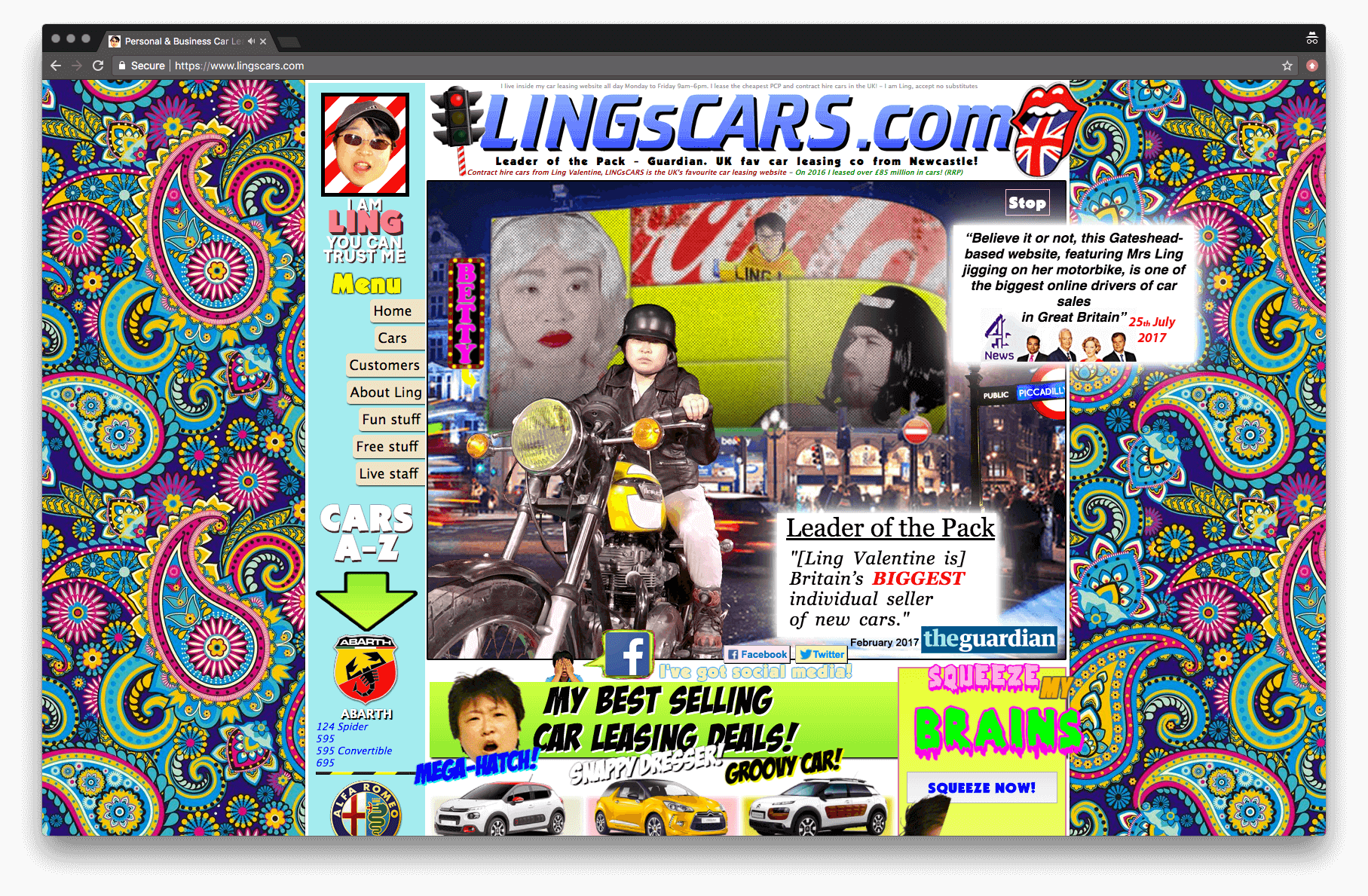
Eye-catching, whizbang look-at-me elements. See animated GIFs in the mid-90s.
Auto-play video (or music). Not a good idea.
Omitting common navigation elements e.g., “Where is [Search | Login | Support | Contact | some other basic thing]?” The flipside of this is having too much navigation, or
Too clever navigation—i.e., using clever words for common navigation elements. More on common navigation mistakes here.
Too clever interfaces—here’s looking at you, Snapchat.
Text/images/elements that are too big.
Text/images/elements that are too small.
Confusing icons i.e., icons that don’t clearly convey what they represent. Useful resource on icons here.
Abusing color or using color combinations that hurt usability or hurt your eyes.
Graphics for text.More on this.
Missing calls to action (CTA)
—what is the “Okay, now what …” for your users? Every web page has a default call to action—it’s that X to close the browser tab.
2. Performance
Is your site or app slow to load? In 2010, a page viewed on a computer that took 4 seconds to load would see a 30% decrease in page views.
Fast forward to 2012, and that same 4 second page load would drop your page views by 40%. Jump to 2016, and 53% of mobile site visits are abandoned if pages take longer than 3 seconds to load[1].
It's 2018—what do you think the impact of slow-loading sites is now?
Today, nobody has time for anything. Everyone is impatient. Attention is scarce.
Site or app performance is table stakes.
3. Aggressive tactics
While only some of the tactics below are downright shady, all are pushy enough to test the limits of your users' patience.
Pop-ups, pop-unders, lightbox overlays, etc. How fast can you find and click the “X”?
Perhaps the most egregious offender that still gets a lot of playtime is the CTA to "sign-up for our newsletter" lightbox overlay—triggered on the first visit to a site after a handful of seconds. Or triggered right when you've shown intent to leave, which usually backfires and simply emboldens users to bounce.

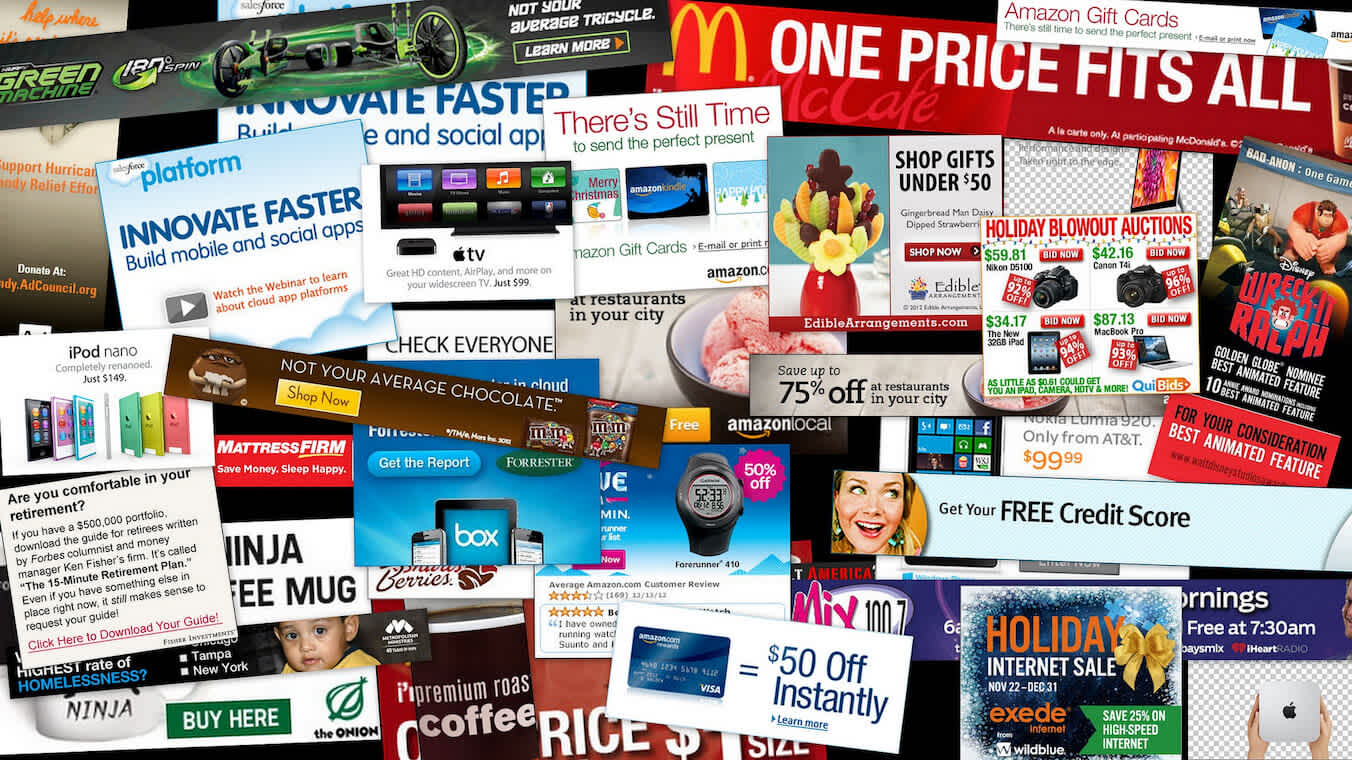
Ads! In particular, the ones that take over the entire screen, mandate you watch them, autoplay sound, and on and on.
While advertisements may be a required revenue stream and the more in-your-face the ads are, the more likely they are to be seen, clicked, and valued, there's a tenuous balance, and the rise in ad-blocking software is a solid indicator that many advertisers and publishers are taking ads too far.

Additionally, advertisements with clickbait thumbnails or titles create cognitive load for your users, who must tease out if the "article" is real or an ad. That's not fun. Associating your brand with clickbait should likely be avoided.
Opt-in boxes, automatically checked. Automatically being opted-in to marketing materials may increase sign-ups, but they can also infuriate your users. Tread lightly.
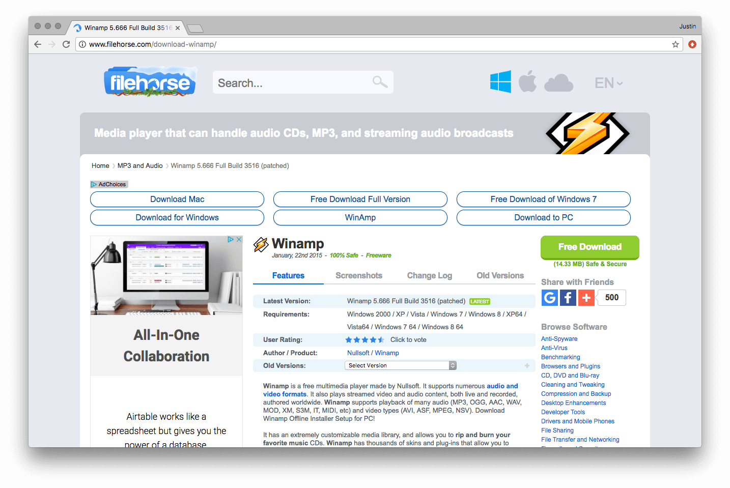
Which one/where's the download button? While this should go without saying, attempting to trick users into clicking the wrong button sows distrust, at best. If ad placements on your site sit near critical buttons, consider how those advertisements may mislead your users.

Show notifications. Who could have guessed the ability to allow websites to notify you through the browser would be abused? It's now common practice to arrive at a random website for the first time and have to tell it that, no, you don't want it to notify you.

4. It’s broken

If your website or application isn't working, it's highly likely your users are going to notice. Granted, the site or application may not be working for lots of reasons. Here are just a couple:
User error. Sometimes users can’t seem to figure out how to use your site or app so that it functions properly. Like it or not, they are going to blame your product for the failure.
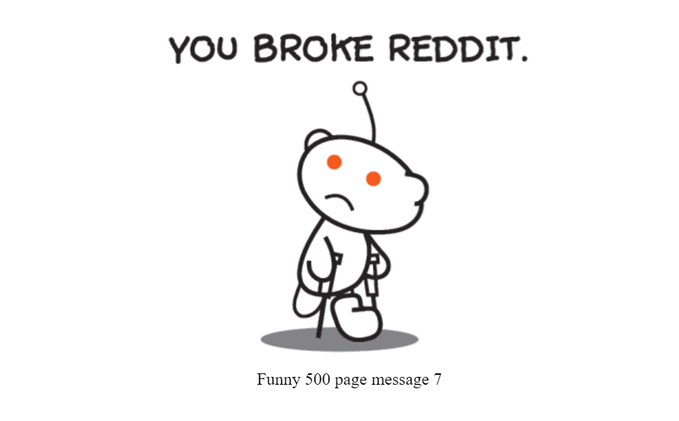
Bugs. Some part of the site is broken. Perhaps it’s a JavaScript error. Perhaps a missing page. It's hard to say unless you do some forensics on your site (Fullstory is built to help solve bugs).
5. It's taking too long to do [x]
When it comes to web design, it's easy to turn a simple task into something overly complex or tedious. When it comes to web design, it’s easy to turn a simple task into something overly complex or tedious, disrupting the user flow.

This is similar in nature to performance: if users feel the process to reach a certain page on your site (or point of conversion) is too slow, they will quickly become frustrated.
Filling out forms or navigating the checkout process are two trouble areas that can rapidly turn into a bad user experience. Consider that roughly 70% of consumers will abandon their shopping cart with over 1 in 4 citing the checkout process was "too long/complicated[2]."
6. I’m confused and/or I have no idea what I’m doing
Ever hit a site or app and think, “I should be able to do this—why isn’t it working?” That kind of UI confusion is a top frustration. A quick pass of lightweight user tests in a UI design tool, paired with real-world feedback, exposes those head-scratchers fast so you can fix them before users bail.

Most users will just leave with only a select few making it over to the Help documents. An even smaller number will actually reach out for support. Conducting user testing can provide actionable insights to improve the user experience and address these obstacles.
7. My device is broken and/or my Internet connection stinks, etc.
We've all been there: a slow (or missing) Internet connection; a lagging, uncooperative device.

The kicker about this one is that it doesn't have to be your site's fault for your site (or app) to take the blame.
One solution, though not an easy one, is to prepare the responsive design of your site for users who might have poor Internet connections. Google, for example, encourages employees to test out their products over slower Internet speeds by mimicking 3G (and other) connection speeds as options across the Google corporate Wi-Fi.
There are no perfect solutions—if any exist, at all—for this one. You will need to get creative.
Bonus! Moving elements
This one is too good—and too pervasive across our categories—not to give it explicit mention.
Have you ever gone to click something only to—at the last instance—have that element move due to some later-loading advertisment or other site elememt? It's instantly enraging, and a terribly common problem.
Whole articles have been written about solving this problem. Suffice to say, when users lose trust in your site to behave predictably when they tap or click, how can you expect them to click or tap when it counts?
3 steps to go from bad UX to building a better user experience
Awareness is only the first step to reducing frustration online—it lacks teeth until you put your knowledge to work, so take action.
Spread the word: Share this post! You are a bad ux 'pert, but are your co-workers? What about people outside your team?
Replay the user experience on your site as seen by your visitors with session replay.
Measure customer sentiment—either directly or indirectly.
Now it's on you to eliminate the bad user experiences on your site or app, and work toward a more perfect web.
Additional reading
This post is part of the Guide to Understanding Frustration Online—go read the rest!
Fullstory identifies Rage Clicks, Error Clicks, and Dead Clicks. It can even combine these frustration signals to surface your Most Frustrated Sessions.
70% based on an average based on 37 studies. US online shoppers have abandoned an order in the past quarter solely due to a “too long / complicated checkout process.” Via baymard.com 2017 research. ↩︎


